Asked by Walker Terry on May 07, 2024

Verified
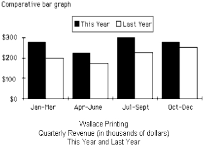
The table below displays the quarterly revenues of Wallace Printing for this year and last year. The numbers are all in thousands of dollars. Use Figure 24-6 to construct a comparative bar graph for the data. Label where necessary. Shade the bars for each year differently. 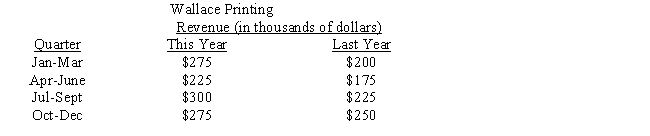
Comparative Bar Graph
Two bar graphs combined on one grid, to compare two different sets of comparable data.
Quarterly Revenues
The total income generated by a company during a three-month period from its business activities.
- Construct and evaluate bar charts for side-by-side comparison of various data collections.

Verified Answer
JD

Learning Objectives
- Construct and evaluate bar charts for side-by-side comparison of various data collections.
Related questions
Last Year, David Lum Opened a New Pharmacy ...
The Table Below Displays the Quarterly Revenue of Wallace Printing ...
The Bar Graph Below Represents the Highest Education Level Achieved ...
A Graphical Presentation of the Relationship Between Two Quantitative Variables ...
A Graphical Tool Typically Associated with the Display of Key ...